If the HOLC redlining maps were drawn 80 years ago, why are they relevant today?
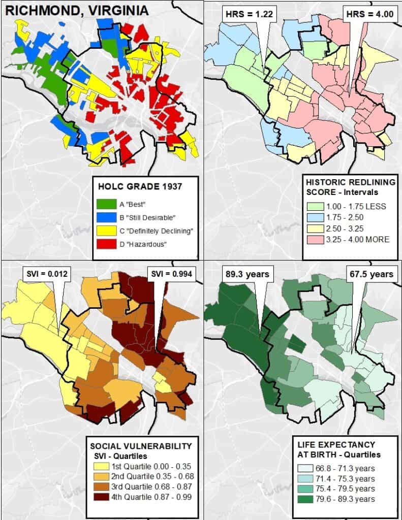
Why would neighborhood maps drawn by the federal government 80 years ago have any relevance to people living in those communities today? If those maps were the ones created by the Home Owners’ Loan Corporation (HOLC) starting in the 1930s, then many of the neighborhood characteristics that they documented persist to this day. For example, over three-quarters of the neighborhoods that HOLC agents classified with their worst rating of “hazardous” and shaded in the color red are today low- to moderate-income and majority-minority. A new NCRC report documents that over 8.25 million people today live in these areas that were “redlined” 80 years ago. The inequities of residential segregation, cemented in place by redlining, persist in lower home values, higher rates of poverty, and greater vacancy and abandonment. Most troubling is how residential segregation is embodied in the health of people living in redlined areas with higher rates of asthma, hypertension, COPD, diabetes, kidney disease, obesity, stroke, and worse mental health. In some cities, like Richmond, Virginia, there is up to a 21-year difference in the life expectancy of residents born in a neighborhood that was redlined, versus another neighborhood with the “best” possible rating from the government. So residential segregation is embodied in a very real way in the health and life expectancy of people living in formerly redlined areas today.
But how has this happened – that a persisting structure of racial segregation and inequity exists to this day? The government maps documented the segregated structure of American neighborhoods immediately before a crucial era in the development of our cities – after World War II. During that period of massive suburbanization, White households had the opportunity to obtain government-backed FHA and VA mortgages at favorable terms. Because of redlining, minority households did not have the same opportunity to receive a government-backed mortgage. This allowed White households to build equity and wealth through homeownership, an opportunity denied to most people of color at that time. As suburbs grew and developed, partly through what was in effect a federal subsidy, the downtown cores of many cities underwent disinvestment and languished, or drastic urban renewal which often resulted in subsequent abandonment.
Today, most American cities have a persisting segregated housing structure which results in dual housing markets that segregate wealth-building opportunities. In order to change the segregated structure, we need to understand its origins, and also where it persists today.
To help researchers, policy makers and advocates assess the present impacts of past redlining, Dr. Helen Meier of the University of Michigan’s Institute for Social Research and I developed a historic redlining score. This improves on the method NCRC used to produce its first report on the enduring impacts of redlining, published in 2018, which was complex and required the use of geographic information systems. The new historic redlining score was created using census tract boundaries for both the 2010 census and also for the 2020 census. This means that it will be useful when combined with past data, like census data from the longitudinal tract database (LTDB) from Brown University that adjusts census data from 1970-2019 to the 2010 tract boundaries. Since the historic redlining score was also created for 2020 census tract boundaries, it will be relevant many years into the future as new US Census products are developed and released.
As an example, the HOLC map of Richmond, Virginia, shows a pattern of redlining surrounding its downtown core, with higher graded areas radiating outward to what were the suburbs when the map was drawn in 1937. (Figure 1). By overlaying that map with the census tracts from 2010, we produced the second map, with the historic redlining score reflecting the intensity of redlining with the value 1.00 indicating the “best” graded neighborhoods, and 4.00 a completely “hazardous” or “redlined” grading. The third panel clearly connects greater redlining with greater social vulnerability or the degree of difficulty that an area would have in coping with and recovering from a disaster – like the COVID-19 pandemic or a hurricane. The fourth panel makes the connection between redlining and reduced life expectancy clear. Two census tracts are indicated with low and high levels of redlining. The census tract which was entirely redlined by being graded “hazardous” is about six miles from the “best” rated area – six miles that translate into a 21-year difference in life expectancy.

This example shows how the historic redlining score can be used to research economic conditions, access to services, exposure to environmental hazards, and health outcomes in communities. The HOLC maps provide historical documentation of how residential segregation was cemented in place as America’s cities developed. A publicly available historic redlining score gives researchers the tool that they need to assess the connections between redlining and present outcomes impacting the health and wealth of communities.
Learn more: Read full research paper with methodological details.
Bruce C. Mitchell, Ph.D. is a Senior Research Analyst at NCRC.


