Tracing the Legacy of Redlining:
A New Method for Tracking the Origins of Housing Segregation
February 2022
Photo: ©Brian Jackson – stock.adobe.com
Helen C.S. Meier, MPH, PhD., Assistant Research Scientist, University of Michigan
Bruce C. Mitchell, PhD., Senior Researcher, NCRC
— Key Takeaways
Redlining was one form of federal policy which segregated communities and concentrated disadvantage. The maps are the most comprehensive existing archive of data available to tracing the historical legacy of residential segregation.
Eighty years after the HOLC formally drew its redlining maps, those neighborhoods are still high minority population areas with the highest rates of vacancy in their metropolitan areas.
Our synthesis of historic redlining scores from the HOLC with Census 2010 and 2020 tract boundaries provides a new tool for identifying the degree to which mid-20th century redlining practices continue to shape housing segregation and concentrated disadvantage today. This updates a 2018 report and offers a new dataset for the historic redlining score, with the Census 2010 and 2020 tract boundaries.
— Key Findings
Persisting segregation – 8.25 million people live in neighborhoods identified by the federal government 80 years ago as “hazardous” and redlined since that time, per 2020 Census data. More than three-quarters of these Americans identify as belonging to a minority group.
The concentration of Black and Hispanic residents in redlined areas is high – The average redlined neighborhood is predominantly Black (32%) and Hispanic (30%).
Greater levels of vacancy or abandonment in redlined neighborhoods – Levels of housing vacancy are much higher in “hazardous” redlined areas at nearly 10%, contrasted with only about 6% in areas of cities that were not graded by the federal government. This suggests that there are greater levels of abandonment in redlined areas.
Introduction
A fundamental element in the social dimension of US urban residential patterns is racial segregation (Massey & Denton 1998). One practice—that of redlining—was essential to establishing the racially segregated neighborhood structure which continues to persist in many cities (Rothstein 2017). During the 1930s through the postwar period the construction of homes across newly developing residential tracts, expansion of the federal highway system, and availability of low interest/low down payment mortgages underwritten by the Federal Housing Administration (FHA) and the Department of Veterans Affairs (VA) contributed to rapid suburbanization of the White middle class (Jackson 1987). Redlining – the denial of access to financial services such as mortgage loans or insurance for people living in minority neighborhoods, was a common practice during this important era in the development of the US urban system (Aaronson et al. 2017). Redlining was government sanctioned. Mortgage loans insured by the FHA were subject to redlining practices until 1962 when President Kennedy banned the practice by federal agencies (Executive Order No.11,063, 1962). Private lenders continued to redline areas without penalty until the Fair Housing Act of 1968 made it illegal (Department of Housing and Urban Development n.d.).
Redlining was one practice among several that created a system of inequitable access to credit, reinforcing economic and residential segregation (Shapiro 2004). While mortgage credit flowed to White families—allowing them to purchase new homes and build equity—families living in redlined areas were denied the same opportunity. People of color could not purchase properties in the newly developed suburbs, nor did they have sufficient access to credit to reinvest in their neighborhoods. The resulting low rates of homeownership are one factor that has continued to exacerbate the wealth divide between White and minority households (Bhutta et al. 2020). Decades of discriminatory lending practices by the FHA and VA cemented the segregated residential pattern of structural racism in US urban areas.
The most comprehensive source of maps delineating which neighborhoods would have been redlined are the Home Owners’ Loan Corporation (HOLC) residential security maps (Nelson et al. n.d.). The HOLC maps were created between 1935 and 1940 and documented neighborhoods in over 200 cities. As they created these maps, HOLC examiners relied upon information gathered from local real estate and lending professionals to complete standardized forms that comprehensively evaluated not only the site and location, structural condition, and past valuations of properties, but also the social and demographic make-up of neighborhoods (Winling & Michney 2021). The examiners used a four-tiered grading system in order to classify neighborhoods: a grade of “A” was reserved for the “best” neighborhoods, which were colored in green on the map—while the lowest graded areas received a “D,” or “hazardous,” rating and were shaded red. Neighborhoods with a population that was not of native-born European background were generally downgraded, and almost invariably a neighborhood with any African American presence received the lowest grade of “D”
While the HOLC itself refinanced loans in both White and Black neighborhoods in the period 1933-1936, before the residential security maps were completed, the FHA did practice redlining (Hillier 2003). An in depth study of FHA lending patterns and the HOLC maps in Baltimore, Greensboro, and Peoria found that “hazardous” graded areas received only 1.6%, 2.2%, and 1.2% respectively of all loans the FHA made in these cities between 1935 and 1940 (Fishback et al. 2021). High graded areas with “Best” and “Still Desirable” ratings received 67.3%, 53.1%, 73.9% of the FHA loans made during that period. Mortgage lending by the FHA favored new developments or neighborhoods that were graded highly on the HOLC maps and avoided “hazardous” neighborhoods.
Redlining denied access to financial services in neighborhoods, concentrating disadvantages and resulting in higher measures of social vulnerability today (Richardson et al. 2020). A key question in understanding the legacy of redlining in US neighborhoods is: Who lived in these neighborhoods in 2020? A spatial mismatch between historic neighborhood boundaries and current census tracts—the level at which many sources of data (i.e., demographic, health, etc.) is available—is a barrier to using HOLC maps in demographic research. To overcome this spatial mismatch and facilitate research on historic redlining policies, we used ArcGIS to create weighted redlining scores for 2010 and 2020 census tract boundaries, representing the degree of redlining within a tract. We then used the 2020 US Census Bureau data to determine:
- How many people today live in the HOLC “D,” or “hazardous,” graded areas?
- What is the demographic profile of “hazardous” areas contrasted with better graded “best” areas?
- How many housing units are in “hazardous” areas?
- What is the rate of vacancy for housing in “hazardous” areas?
- Are there significant differences in the race/ethnic composition of “hazardous” areas compared to non-hazardous areas?
This new report updates our findings from the 2018 report and introduces an updated historic redlining score method which can be used with the Census 2020 tract boundary files.
Methods
Creating a historic redlining score
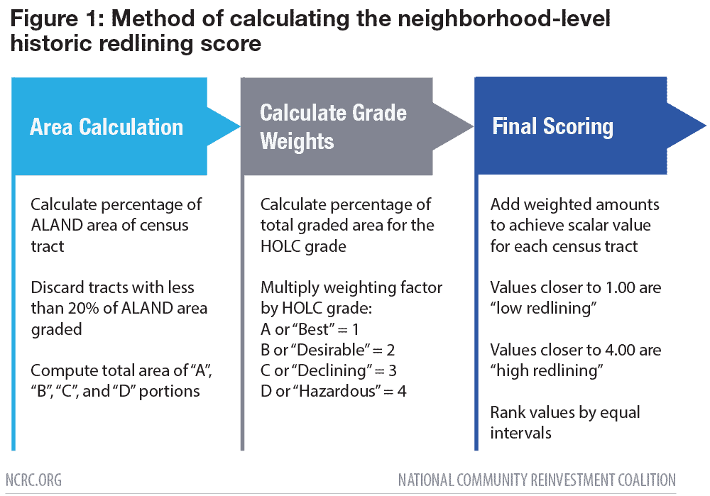
Data from the residential security maps created by the HOLC’s City Survey program is hosted by the University of Richmond Digital Scholarship Lab as part of their “Mapping Inequality: Redlining in New Deal America” project (Nelson et al. n.d.). These maps are available as georectified shapefiles, suitable for projection and use in geographic information systems (GIS). We overlaid the HOLC maps with 2020 census tract boundary files for 146 metropolitan areas across the US using ArcGIS and determined the proportion of HOLC residential security grades contained within the boundaries. We assigned a numerical value to each HOLC risk category as follows: 1 for “A” grade, 2 for “B” grade, 3 for “C” grade, and 4 for “D” grade. We calculated a historic redlining score (HRS) from the summed proportion of HOLC residential security grades multiplied by the corresponding weighting factor based on area within each census tract. A higher HRS means greater redlining of the census tract, with a value of 4.0 corresponding to complete redlining (Figure 1).
Assessment of 2020 Census and HRS
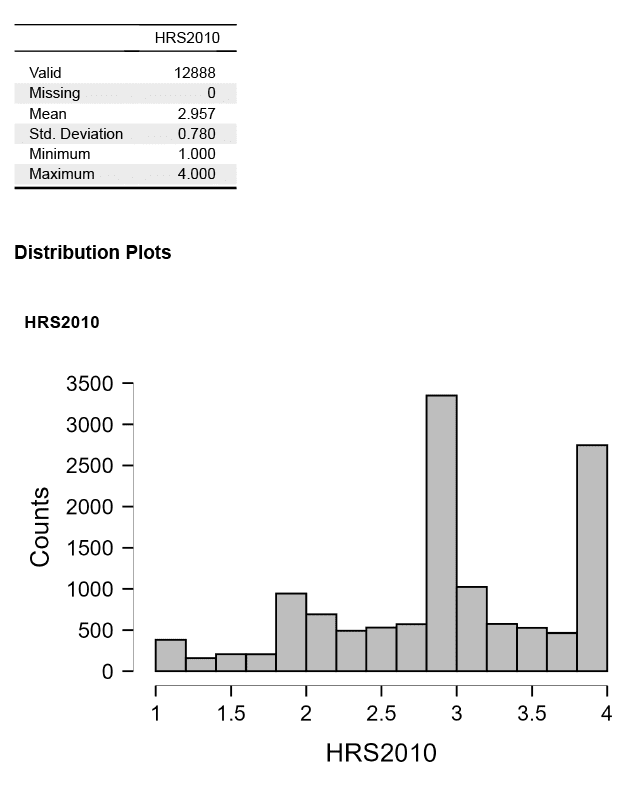
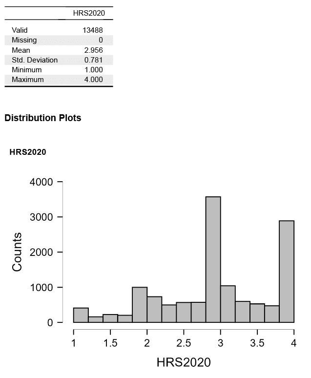
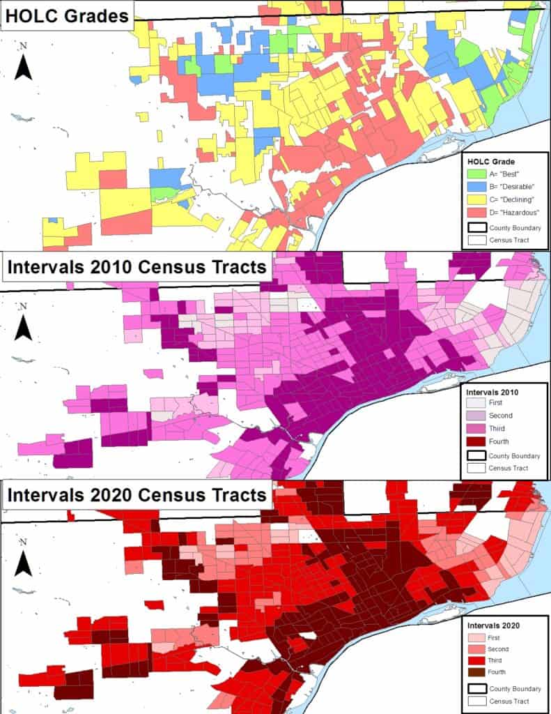
The continuous HRS, assessing the degree of redlining, were linked to the available Census 2020 P1 file, with population data and H1, with data on housing (Census Bureau 2021). The census files are currently limited to demographic counts, with the housing data consisting of the number of units and their occupancy status. Data to assess the number of rentals and homeownership were not available. Next we analyzed the distribution of the HRS for both 2010 and 2020. The resulting continuous distributions were multimodal, with clustering at the 1.0, 2.0, 3.0, and 4.0 intervals. This clustering was the result of the influence of tracts with “pure” HOLC grading on the distributed values. Consequently, dividing the distribution into equal intervals with ranges of: 1.00-1.749; 1.75-2.49; 2.50-3.249; 3.25-4.00 allowed for an analysis of tracts ranging from the least to the most impacted by redlining. Tracts in metro areas not meeting the 20% threshold for HOLC-graded areas were assigned a “0” value and assessed separately as “ungraded” tracts. Figure 2 provides an example of the HOLC grading and the resulting intervals for Detroit, Michigan.
Descriptive statistics were calculated for the ungraded and the HOLC-graded tracts, as well as the intervals. Finally, associations between historic redlining score and 2020 demographics were assessed by calculating Pearson’s correlation coefficient for binary associations and by an ANOVA to determine the statistical significance of the differences in mean values.
Results
Descriptive statistics for ungraded tracts and for the 13,424 tracts with an assigned HRS are presented in Table 1. Comparisons of the ungraded and HOLC-graded areas indicated that the ungraded areas had higher average population, higher percentage of non-Hispanic White, more housing units, and much lower rates of vacancy. The mean value of all 2020 census tracts with HOLC grading and a historic redlining score was 2.95, which interpolated to a “C” grade. On average, tracts with HOLC grades (downtown cores of metropolitan areas) had a higher proportion of minority residents (69%) than areas ungraded by HOLC (commercial areas and undeveloped areas or farm land).
The first question—how many people today reside in the HOLC “D”, or “hazardous” graded neighborhoods—required analysis of the most redlined census tracts within the distribution. Tracts with an HRS of 4.0 were selected. This ensured tracts with 20% or more of their area graded by the HOLC as “D” or “hazardous” for the entire area were included. Data for the ungraded areas is also displayed for reference, since these areas held the bulk of the population (115,286,483 residents) and housing units (46,396,339) in the metro areas with existent HOLC maps (Table 2). The population living in the most severely redlined tracts totaled 8,251,378, amounting to 2.5% of the US population.
To address the second question—what is the demographic profile of “hazardous” areas contrasted with better-graded areas—the “hazardous” redlined tracts were compared to tracts with the “best” rating. To understand the population distribution of redlined versus non-redlined areas, we compared neighborhoods with an HRS of 4.0 (N=2,423) to the “best” neighborhoods with an HRS of 1.0 (corresponding to 100% “A” grade, N=277). The “best” graded tracts contained a much smaller population (921,403)—that is only 0.3% of the US population. There were stark demographic differences between the most severely redlined tracts and the best graded tracts: the average minority population is 76.6% in the “hazardous” graded tracts but only 34.4% in the “best” graded tracts. The “hazardous” tracts had an average Black population of 32.2% and Hispanic population of 29.0%, contrasted with 11.8% and 11.5% in the “best” graded tracts. When the demographics of all the HOLC graded tracts divided by intervals was considered, the pattern was of greater minority presence as the intervals increased.
For the third question—what is the rate of vacancy for housing in “hazardous” areas—we examined the distribution of housing units and vacancy by historic redlining status. In Table 3, housing units in tracts within the better graded areas are compared with tracts in the redlined areas—amounting to 442,132 and 3,601,296 total units respectively. This was proportionate with the larger populations living in the “hazardous” tracts. Rates of vacancy were comparable at 9.1% and 9.9%. However, vacancy levels in ungraded tracts were lower at 6.3%.
The results shifted considerably when the means of the tracts for the entire distribution were examined in Table 3. First, housing located in HOLC ungraded tracts were two-thirds of distribution and had the lowest vacancy levels. Of the HOLC graded areas, 22.2% of housing was located in low graded tracts of intervals 3 and 4, while 8.5% were in higher graded areas. Only 1.5 million units, or 2.3% of total housing stock, were located in the highest-graded tracts of interval 1. All of the HOLC graded areas had higher levels of vacancy than ungraded areas, with the first through third intervals ranging from 8.2% to 8.6%—but increased to 10.7% for the fourth interval.
Finally, we estimated the association between proportion of minority residents and vacancies in 2020 and the degree of redlining in census tracts. Figure 3 visually reports the Pearson’s correlation coefficients for HRS2020 and 2020 US Census demographic variables with dark blue values corresponding to a correlation of 1 and dark red values corresponding to a correlation of -1. Statistically significant associations were observed between greater HRS value—indicating increased levels of redlining—with tract-level measures of greater percentages of minorities, Black and Hispanic residents, and increased housing vacancy. The HRS has a statistically significant negative relationship with the percent of non-Hispanic White residents of a given tract. These results were in line with an ANOVA comparing the means of tracts at the fourth interval to all other tracts (Appendix: A-4).
Discussion and Conclusion
The spatial mismatch between neighborhood borders based on boundaries established by the HOLC examiners and the organization of recent health, economic and neighborhood data at the census tract-level is a challenge to studying the legacy of redlining. The implementation of a geographically weighted metric of the HOLC grading, like the HRS, allows a variety of tract-level datasets to be linked for comparison and spatial analysis. In this case, the 2020 Census data allowed us to evaluate past redlining and current neighborhood-level demography. Our results are an example of how segregation—maintained through social attitudes and practices, enforced by legal measures, and implemented through the racialized evaluation of financial risk—shaped residential patterns visible today.
Analysis of the 2020 Census data indicates a clear demographic split between HOLC better graded and low graded, or redlined, tracts. The tracts covering areas that were graded highly in the 1930s by HOLC examiners were in 2020 largely non-Hispanic White neighborhoods, and the tracts most impacted by redlining were mostly populated by minority residents. This reflects the persisting pattern of residential segregation in areas where redlining was most concentrated. Tracts in which a greater area was redlined had significantly higher percentages of Black, Hispanic, and other minority residents. The tracts also had increased prevalence of housing vacancy, which is one element of abandonment (Hillier et al. 2003). Taken in total, in 2020—80 years after the HOLC participated in standardizing racially based appraisal methods and described redlined areas—the impact of residential segregation persists. Redlining imposed barriers to the flow of capital in many low-income neighborhoods, and in Black and other minority communities, creating the circumstances for long-term racial segregation.
There are limitations to the HRS dataset. City boundaries have expanded or changed since the 1930s when HOLC grading occurred. Therefore, neighborhoods that were not in existence in the 1930s nor graded by HOLC do not have corresponding historic redlining scores. The commercial areas of cities identified by the HOLC have not yet been digitized for analysis. In addition, there are other forms of structural racism in the housing market—racially restrictive covenants, restrictive deeds, zoning regulations, and public health codes—that are not represented in the redlining data. Our analysis was also limited by currently available Census 2020 data on housing, which contained only the number of units and their occupancy status, making more detailed housing analysis unfeasible.
We have made the HRS publicly available for both 2010 and 2020 census tract boundaries (Meier & Mitchell 2021), allowing consistent quantitative analysis of the HOLC graded areas by researchers and community members alike. Future work will focus on digitizing commercial areas and incorporating other measures of discrimination into the public HRS dataset.
References
Aaronson, D., Hartley, D., & Mazumder, B. (2017). The effects of the 1930s HOLC “redlining” maps (Working Paper No. 2017-12). Chicago, IL: Federal Reserve Bank of Chicago.
Bhutta, N., Chang, A. C., Dettling, L. J., & Hsu, J. W. (2020). Disparities in wealth by race and ethnicity in the 2019 survey of consumer finances. Washington, DC: Board of Governors of the Federal Reserve System. https://doi.org/10.17016/2380-7172.2797
Census Bureau (U.S.). (2021). Decennial census P.L. 94-171 redistricting data. https://www.census.gov/programs-surveys/decennial-census/about/rdo/summary-files.html
Department of Housing and Urban Development (U.S.). (n.d.) Housing discrimination under the Fair Housing Act. Washington, DC. https://www.hud.gov/program_offices/fair_housing_equal_opp/fair_housing_act_overview
Exec. Order No. 11,063, 3 C.F.R 652 (1962). https://www.archives.gov/federal-register/codification/executive-order/11063.html
Fishback, P. V., Rose, J., Snowden, K. A., & Storrs, T. (2021). New evidence on redlining by federal housing programs in the 1930s (Working Paper No. 29244). Cambridge, MA: National Bureau of Economic Research. https://doi.org/10.3386/w29244
Hillier, A. E. (2003) Redlining and the Home Owners’ Loan Corporation. Journal of Urban History 29(4), 394-420. https://doi.org/10.1177/0096144203029004002
Hillier, A. E., Culhane, D. P., Smith, T. E., & Tomlin, C. D. (2003). Predicting housing abandonment with the Philadelphia Neighborhood Information System. Journal of Urban Affairs, 25(1), 91-106. https://doi.org/10.1111/1467-9906.00007
Jackson, K. T. (1987). Crabgrass frontier: The suburbanization of the United States. Oxford, UK: Oxford University Press.
Massey, D. S., & Denton, N. A. (1998). American apartheid: Segregation and the making of the underclass. Cambridge, MA: Harvard University Press.
Meier, H. C. S., & Mitchell, B. C. (2021). Historic redlining scores for 2010 and 2020 US Census tracts. Ann Arbor, MI: Inter-university Consortium for Political and Social Research. https://doi.org/10.3886/E141121V2
Nelson, R. K., Winling, L., Marciano, R., Connolly, N., et al. (n.d). Mapping inequality. American Panorama. https://dsl.richmond.edu/panorama/redlining/#loc=5/39.1/-94.58&text=intro
Richardson, J., Mitchell, B. C., Meier, H. C. S., Lynch, E., & Edlebi, J. (2020). Redlining and neighborhood health. Washington, DC: National Community Reinvestment Coalition. https://ncrc.org/holc-health/
Rothstein, R. (2017). The color of law: A forgotten history of how our government segregated America. New York City, NY: Liveright Publishing.
Shapiro, T. M. (2004). The hidden cost of being African American: How wealth perpetuates inequality. Oxford, UK: Oxford University Press.
Winling, L. C., & Michney, T. M. (2021). The roots of redlining: Academic, governmental, and professional networks in the making of the New Deal lending regime. Journal of American History, 108(1), 42-69. https://doi.org/10.1093/jahist/jaab066
Appendix
A-1 A full dataset of the historic redlining score (HRS) adjusted for Census 2010 and 2020 boundaries is found on OPENICPSR: www.openicpsr.org
A-2 Descriptive statistics and frequency distribution of HRS for Census 2010 and 2020 tract boundaries.