This is one in a series of essays accompanying NCRC’s 2020 analysis that showed more chronic disease and greater risks from COVID-19 in formerly redlined communities. The views and opinions expressed in this article are those of the author and do not necessarily reflect the views or policy positions of NCRC.
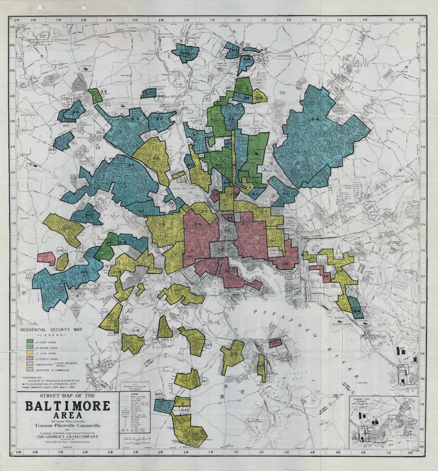
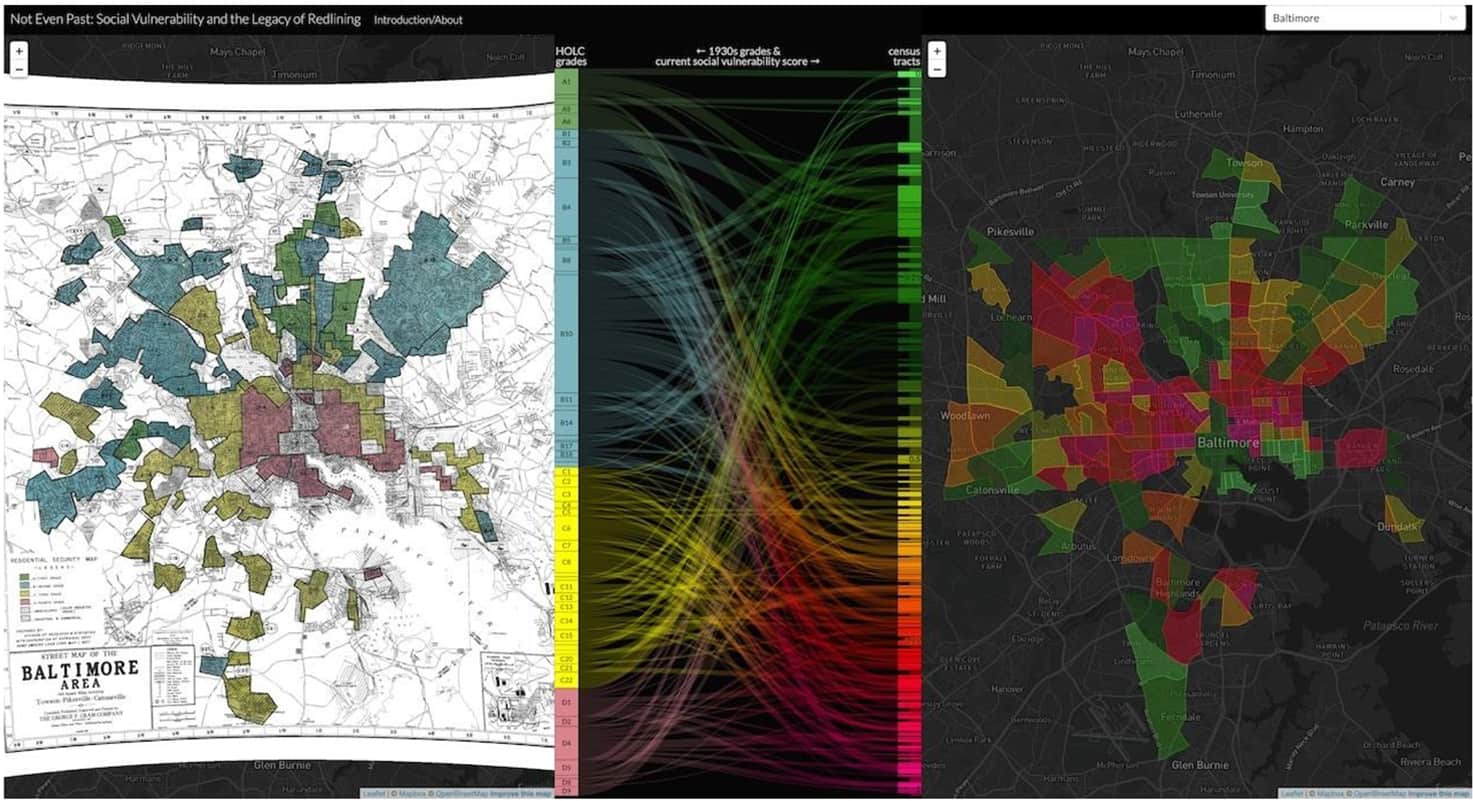
In the latter half of the 1930s, a now defunct federal agency, the Home Owners’ Loan Corporation (HOLC), executed a program to categorize the “residential security” of neighborhoods in U.S. cities and towns with populations of 40,000 or more. They worked with local lenders and real estate experts in over 200 cities to gather and organize information about all the residential areas of a city and then assign each a grade on a scale of A to D. These grades were all about mortgages. Neighborhoods that received an A grade were judged to be safe investments “where good mortgage lenders … are willing to make their maximum loans.” On the other end of their grading scale, D areas were described as “hazardous,” and HOLC recommended that lenders “refuse to make loans in these areas [or] only on a conservative basis.” HOLC then visualized these grades on maps for each city with A neighborhoods colored green, B neighborhoods blue, C neighborhoods yellow and D neighborhoods red. Thus, the term redlining: the denial of access to mortgages to individuals wanting to buy homes in certain neighborhoods.
 The phrase “residential security” referred to the security and relative riskiness of mortgages. But the supposed security of mortgages was premised upon another kind of residential security: the security of White neighborhoods remaining White. The area descriptions that HOLC collected for thousands of neighborhoods made many residential areas sound like they were under siege: some neighborhoods were being invaded and destroyed, others were successfully resisting invasion, others were safe and stable well behind the lines.
Who were the invaders? African Americans and immigrants. In the area descriptions, HOLC asked their agents to quantify the “infiltration” of “Negroes” and the “Foreign-born.” The “infiltration” of either of these groups resulted in a lower grade and made it harder, and sometimes impossible, for applicants to secure mortgages to buy homes.
 Neighborhoods that were secure from such infiltration received higher grades. Often that security was provided by restrictive covenants written into deeds that prohibited the sale of property to people of color; covenants that were often listed as a “favorable influence” in the area descriptions produced by HOLC. Other area descriptions pointed to actual physical barriers that secured White neighborhoods. The A grade assigned to the Merchantville neighborhood in Camden, New Jersey, for instance, was reasonable despite bordering an African American neighborhood because “high walls separates this section from the colored area to the south.”
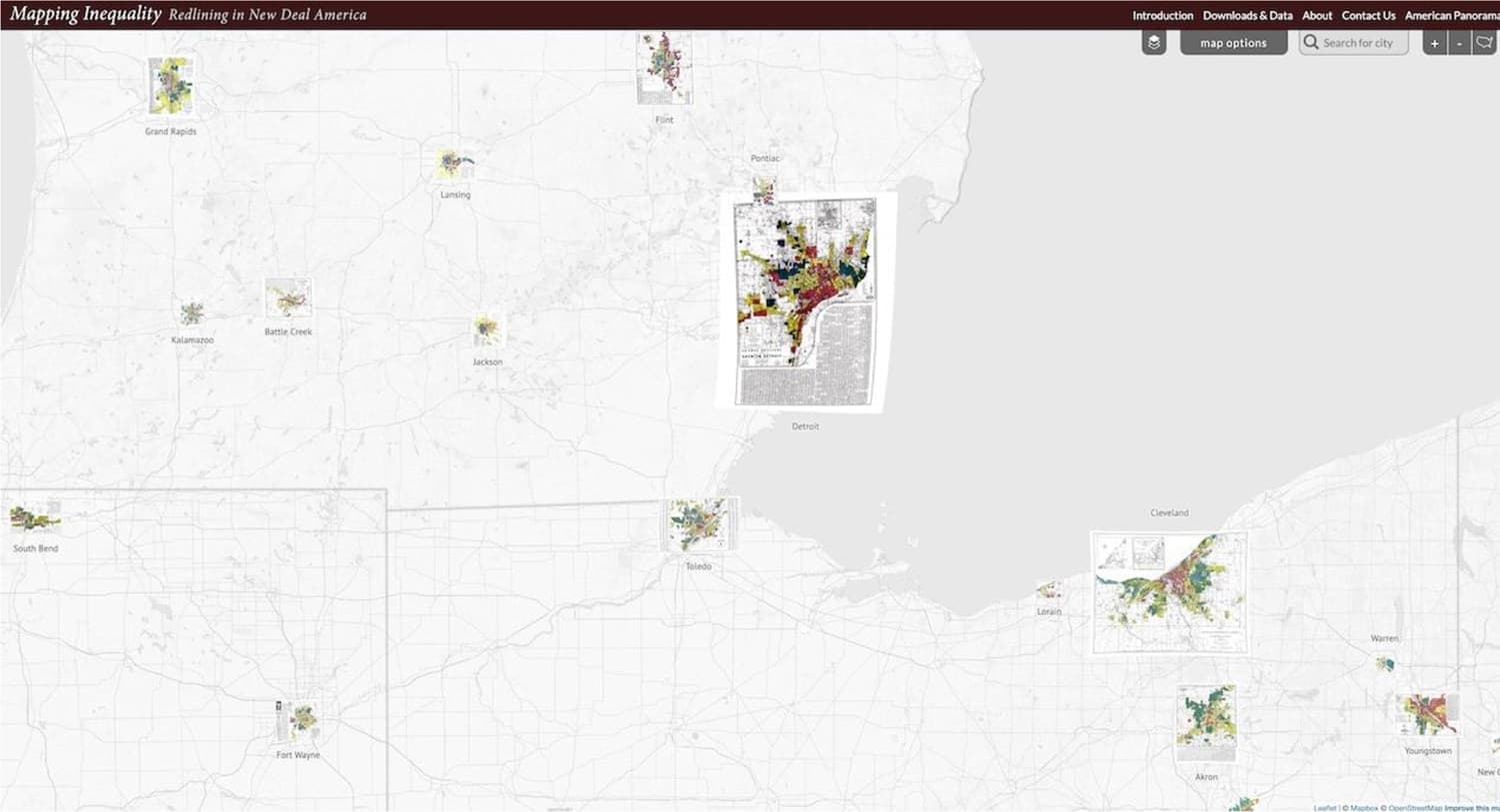
Launched in 2016 by researchers at the University of Richmond, Mapping Inequality is an interactive map that makes these remarkable materials freely accessible and easily explorable. Each of the HOLC maps can be displayed over the contemporary streetscape, and each neighborhood is clickable to read its area description.
While the maps are powerful alone, it’s the underlying area descriptions that provide a far clearer, and sometimes painful, window into the segregationist policies of mid-century America. There is no dog whistle in these HOLC materials — the racism is loud and clear.
“The particular hazard in the area is racial,” states an area description in the Albina neighborhood in Portland, Oregon, “there being a large percent of foreign-born including a number of oriental families and many Russians and Finns.”
“Were it not for the fact that this area is entirely Jewish, it would command a higher rating,” reads another HOLC description for a neighborhood in New Haven, Connecticut.
A small, White area in Richmond, Virginia, received a C rather than a B grade because its residents were “respectable people but [their] homes are too near negro area D2.“
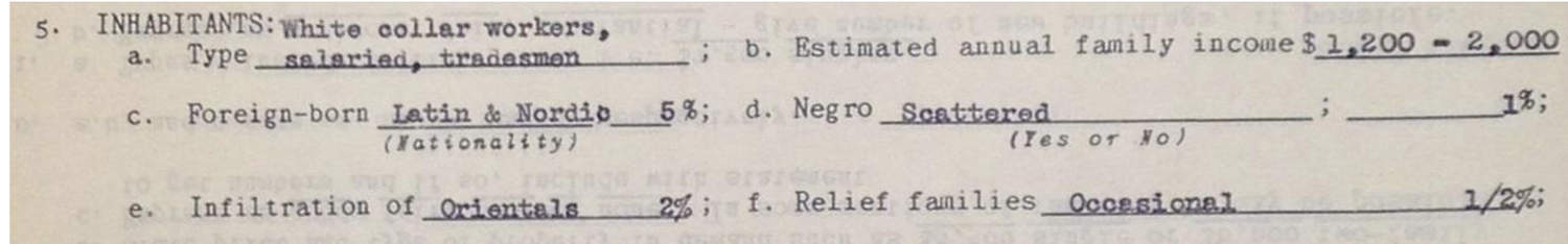 These are just three examples. This kind of racism, antisemitism and nativism is ubiquitous in these materials. It wasn’t just prejudice. It was policy. These maps were produced by the federal government, and they were an important part of decades of government action that preferentially aided native-born, White families in becoming homeowners and building intergenerational wealth through homeownership. The segregation in them was a state-sanctioned and state-advanced segregation. In that way, the HOLC archive is a clear exemplar of the structural and institutional nature of racism.
While Mapping Inequality is by itself a powerful tool for exploring housing policy and segregation eight decades ago — which was the goal of the historian-led team that created it — one of the great surprises of the project has been the innovative work on contemporary equality that other researchers have produced using its data. All the data we produced is freely downloadable.
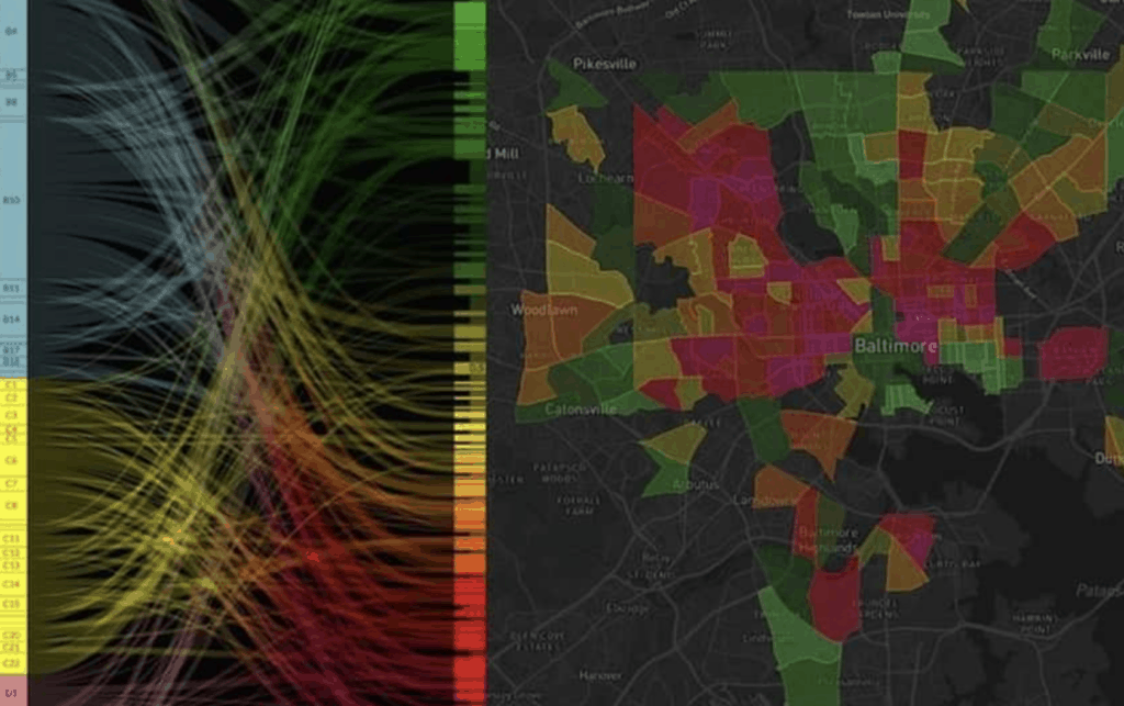
NCRC’s work on the correlation between the health disparities today and the redlining maps of the 1930s is one of these examples, and complements work medical researchers have done on correlations between redlining and asthma rates.
Others scientists have explored how the HOLC maps correlate with heat vulnerability in American cities.
A geographer has analyzed “supermarket redlining” — the pattern where supermarkets today are concentrated in neighborhoods that weren’t redlined and convenience stores in those that were.
 Do these patterns between present inequities and past redlining mean that redlining is the cause of today’s inequalities? Not exactly. Redlining is not ”the” cause, but arguably it is a cause. The production and reproduction of social vulnerability in some areas and relative privilege in others over generations is the product of numerous decisions made in both the private and public sectors — by individual homebuyers and sellers, by banks, by local zoning officials, and, yes, by federal policymakers. The correlations that the NCRC report shows between past and present are important. It’s too simple to say health disparities were caused by redlining. But it’s not too simple to say that governmental housing policies that endorsed and promoted segregation and racism had a profound and lasting legacy that we can still see in the landscape of American cities today. And it’s also not too simple to conclude from this that governmental policies mattered then and could matter now. It’s not too simple to say that the racist policies of the past still require repair through anti-racist policies today — policies like the enforcement and expansion of the Community Reinvestment Act and the building of more low- and moderate-income housing that NCRC so forcefully champions.
